Uniformly bad
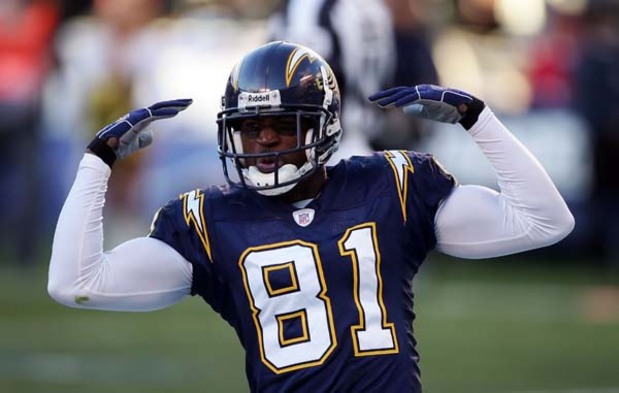
I’ll never understand the need for sports franchises to mess with a good thing. Well, I probably do. Over the years, countless teams have ditched tradition and updated their duds in the name of progress. In recent years, “progress” means adopting a soulless, slick look designed to boost merchandise sales. The latest franchise to hop on this visually offensive bandwagon is the San Diego Chargers.

OK, so maybe this isn’t as bad as it could be. But to me, it’s a totally pointless change. It looks more like one of the crappy uniforms found in the Arena league than the NFL. The key to this new design seems to be the totally slick and in-your-face number design. But the inexplicable placement of the bolts around the shoulders doesn’t help things. My main question is – why? What exactly was wrong with the last design?

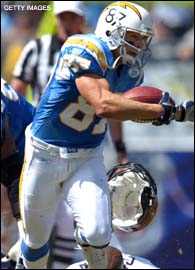
Now that is a decent design – traditional but still visually appealing. Still, it’s a downgrade from an earlier design:

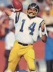
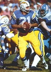
And of course, that’s a downgrade from one of the best designs in all of pro sports:


Thom
Basically every team seems to want black or nearly black uniforms. Being an Eagles fan, this discussion comes up more than you might expect. A large portion of the fan base really grew up with the team in the 80s and early 90s (well, I guess that’s not really odd since usually the biggest fans are guys in their 20s and 30s). Needless to say, we miss our Kelly Greens – but the owner’s wife apparently hates them and won’t let us go back.
I miss the uniforms of that time period because they were all far more distinct: green was green, blue was blue, orange was orange. Now they all need to be “modern” looking, which means they all blur together.