The Best and Worst NFL Logos (NFC West)
With the 2012 National Football League season nearly upon us, now is as good a time as any to obsess once again on one of my favorite topics — logos. So I’m going to offer up my choices for the best and worst NFL logos for all 32 current NFL franchises. Primary, alternate, and helmet logos listed on Chris Creamer’s outstanding logo website are all under consideration. Today, for the last entry, I look at the four squads of the NFC’s West division.
Previous entries: AFC East, NFC East, AFC North, NFC North, AFC South, NFC South, AFC West
Arizona Cardinals
Best
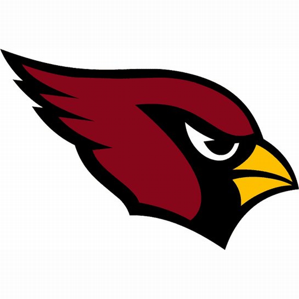
St. Louis/Phoenix/Arizona Cardinals logo (1960 – present)
If there are two things the Cardinals have been consistent about over the decades, it’s the look of their logo and their losing (recent years excepted). I’ve always been a fan of the Cards’ look.
Worst
Chicago Cardinals logo (1920 – 1934)
I guess back in the early 20th century, before pro sports teams were flush with cash, they had to share logos. That explains why this wishbone C shows up for so many other teams.
St. Louis Rams
Best
Los Angeles Rams helmet logo (1973 – 1980)
Man, the classic blue and yellow look of the L.A. Rams was one of the best in sports. They really need to return to that.
Worst
Cleveland/Los Angeles Rams logo (1940 – 1980)
Fun fact — the Rams were the first pro football team to sport a logo on their helmet. This official logo, used with slightly different designs and with different colors over the years, is certainly realistic. It’s also creepy.
I snagged this one from a 1959 L.A. Rams media guide.
San Francisco 49ers
Best
San Francisco 49ers alternate logo (1965 – 1972)
I’m cool with the interlocking SF on the 49ers’ helmets, but this is just so cool and unique. It definitely feels like something from the ’60s, but it’s got a bit of a timeless appeal as well. The shield motif is an interesting choice for San Francisco, and I love the way they incorporated the 4 and 9.
Worst
San Francisco 49ers unused logo (1991), from an Ed DeBartolo press conference.
See that? That’s how close the 49ers came to rolling out an atrocious new logo in 1991. They actually held a press conference to announce it. I don’t think I need to say anything else.
Seattle Seahawks
Best
Seattle Seahawks logo (1976 – 2001)
I know I’m showing my age here. I just have so many memories of the Seahawks from the era of Dave Krieg and Steve Largent, when they were in the AFC West and a hated rival of my beloved Raiders. The update this got in 2002 is OK, but I’ll always prefer the old look.
Worst
Seattle Seahawks logo (2012 – present)
I know what you’re thinking. This isn’t so different from the previous logos, so what’s the big deal?
Well for one thing, the addition of the silver/gun metal gray was totally unnecessary. And for another, this new logo is part of the new Seattle uniforms, which are simply an affront to good taste.

My eyes! The goggles do nothing!
I hate to end this series on such a down note, but it needs to be said — screw you Nike.
Rich S
This is a nice posting and I agree with you on every one of your comments about the team logos. I found this site because I was searching for retro NFL bedding. I used to have NFL bed sheets that my mom bought at Sears back in the 1970s. It had old NFL logos on it and I wish I still had them. A couple of comments I’d like to add: I like the iconic Green Bay “G” , bought they also had another logo I liked with a football player punting over a map of Wisconsin. And Buffalo used to a logo of a football and inside of it was a football player and a bison in the background. BTY these are all logos that were on my bedding. Also Denver had a different logo of a player riding a bronco. But it was kind of cartoony and I guess the “D” with horse is better – but being a Raider fan also, I really don’t care for any Denver logo to be honest.