I Put on My Robe and Wizards Jersey
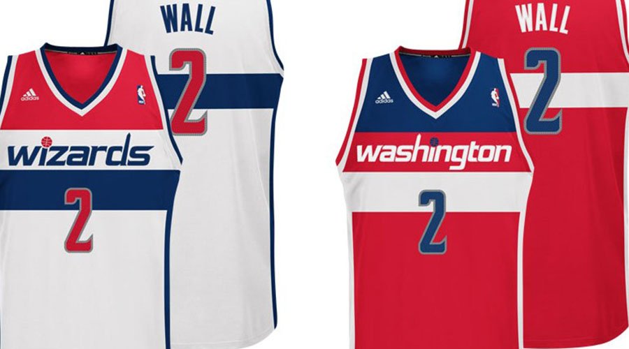
Proving that it’s never too late to right a hideous wrong, the NBA’s Washington Wizards recently unveiled their new look for next season. Which is much like their old look. Witness:
Current Wizards getup (the suck):

Pretty awful, no? The color scheme is decent but that wacky typeface belongs on the packaging for some kids’ drink, and that logo is simply too lame for words.
New Wizards getup (much better):


If those seem familiar to long-time basketball fans, there’s a good reason. The new logo set is basically a lift of the old Washington Bullets look:

Too bad they didn’t go all the way and don those super groovy ’70s uniforms, complete with form-fitting patriotic ball shorts:

In any case, it’s still an upgrade in just about every way possible. Now if only they had the fortitude to unload the name too.
Don Raymundo
The lift of the old Washington Bullets look in the logo is a nice decision. The jersey getup looks much better. If you want to own a jersey like that, visit http://www.wagadoosports.com/american-football-t-shirts/ and display a getup like that.