Here’s the New Jacksonville Jaguars Logo
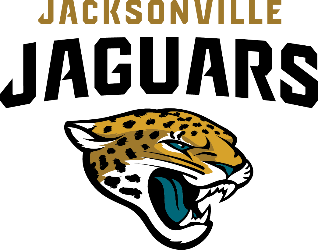
Well, I guess I’ll have to do some updating of my AFC South NFL logo ranking before the 2013 season gets underway. That’s because the Jacksonville Jaguars today unveiled their first new primary logo since the team joined the league in 1995. Here it is:
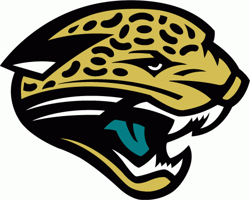
For comparison, here’s the previous version:

Jacksonville Jaguars logo (1995 – 2013)
On the whole, this is a step in the right direction. Obviously this new jaguar is more realistic, and looks like an actual cat rather than a conglomeration of geometric shapes assembled to resemble one. The color scheme of the fur is improved, but then again, there’s that green tongue. It’s like the big cat had a watermelon lollipop before the modeling session.
As overall logos go, this is pretty good. As Jaguars logos go, it’s a step up for certain. Even better is the team’s new alternate shield logo:

Now that’s pretty cool. Well played, Jaguars, well played. You too, Shad Khan.
